© 2016 Araknis Networks
®
71
Araknis Networks Wireless Access Point
Product Manual
Advanced Menu
23.5.3 - Understanding Spectrum Analyzer Results
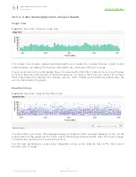
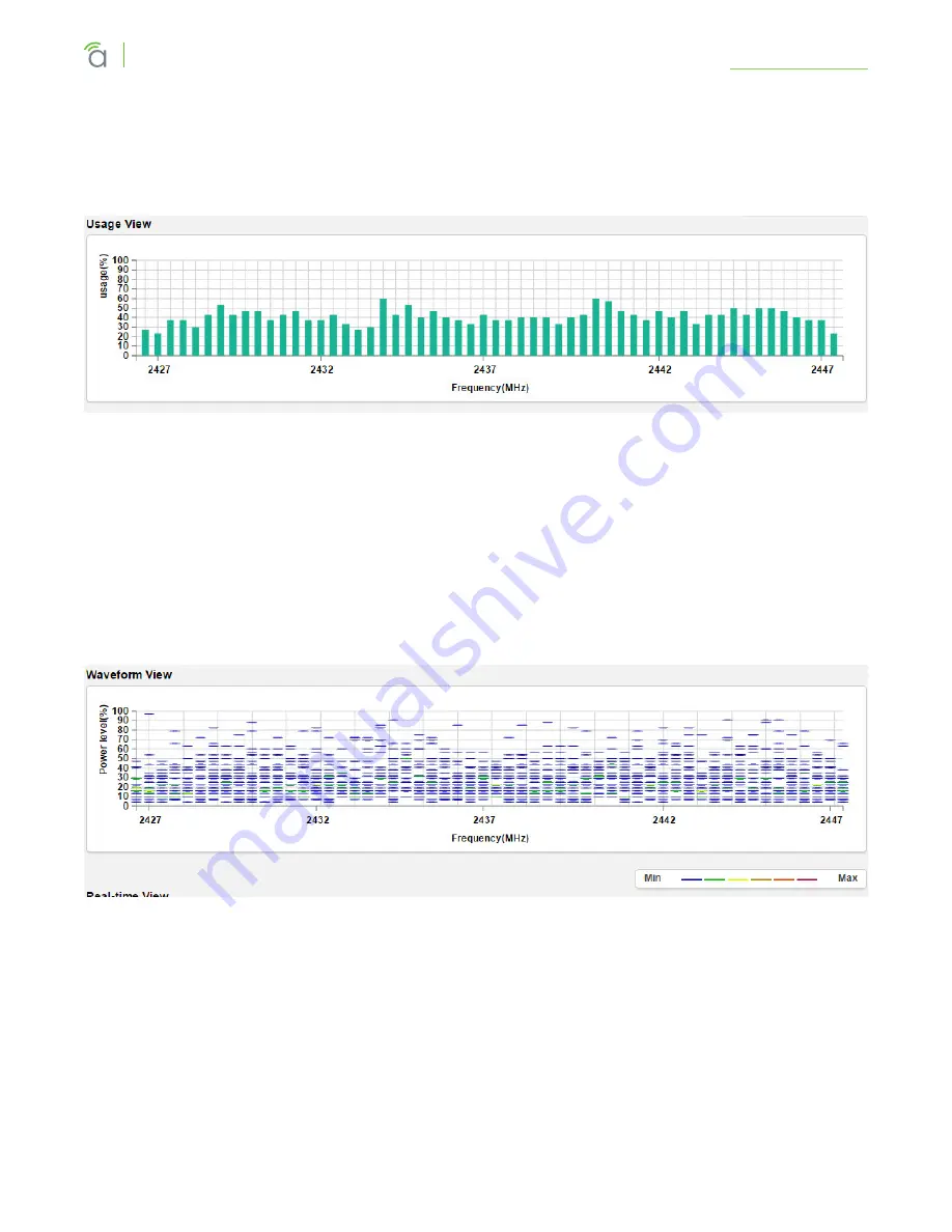
Usage View
Figure 61.
Spectrum Analyzer Usage View
The Usage View displays approximate bandwidth use around the scanned channel. Higher values
indicate higher use. Ideally, the channel selected for use will display little to no usage.
If your results are similar to the graph shown, try reducing the RSSI filter (closer to zero) to see if spikes
of activity become more obvious at certain frequencies. As long as client devices connect at stronger
RSSI values than the selected scan setting, wireless traffic should not be adversely affected by the
activity indicated on the graph.
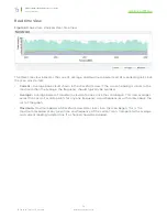
Waveform View
Figure 62.
Spectrum Analyzer Waveform View
The Waveform view shows the aggregate energy recorded at each scanned frequency. Marks on the
graph represent the power level at which signals are being recorded, and the color of the mark rougly
estimates how much data is flowing at that level.
For the best performance, avoid using frequencies where colors indicate high traffic (see scale in
bottom right of image).


