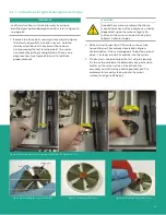
2. If you right-click on any series of data within the graph, or you click on the
current parameter being-trended item in the legend, you will see a variety of
options for graphing data (see Figure 69 below). You can change to a variety
of common plots and adjust color, line style, and line width. For some data sets
with lots of finite points, you may want to click anti-aliased which will smooth
the plot line. You can also change bar plots, fill base line, interpolation and
point style. X-scale adjusts the x-scale. Y-scale adjusts the y-scale and
enables the secondary y-axis.
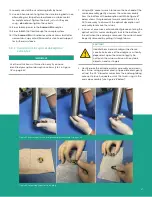
3. There is a series of graph tools available at the top left of the trend plot area
(see Figure 70 below).
•
Pointer
•
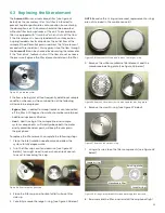
Zoom tool
- gives
you six options as
shown in Figure 71
below.
•
Hand tool
- enables
you to graph the
trend plot area and
move it around
without rescaling.
5.7 Working with trend plots, trend tabular data and scan plots
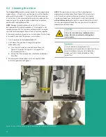
1. Trend plots is a powerful graphing feature in
AuroraView
. You can graph many parameters at the same time
(see Figure 68 below).
Figure 68: Using trend plots
NOTE:
If you use the secondary y-axis, you may see “–“ tick marks preceding the value. These are tick marks from the
graphical applet and not an indication of negative values.
Figure 69: Options for graphing data
Figure 70: Graph tools
Zoom y-axis
Zoom window
Zoom all
Zoom in
Zoom out
Zoom x-axis
Figure 71: Zoom tool
59
Summary of Contents for Panametrics Aurora H2O
Page 2: ...ii...
Page 4: ...no content intended for this page proceed to next page iv...
Page 20: ...no content intended for this page 10...
Page 32: ...no content intended for this page 22...
Page 71: ...Figure 74 Exporting a simplified image Figure 75 Selecting enhanced metafile 61...


