Design principles
Design for a limitless screen
If you are used to designing for a smartphone, you might have organized the screens in your application in a hierarchy. Try
to avoid this approach when you design applications for the BlackBerry PlayBook tablet. Instead of creating an application
with a hierarchy that users have to navigate, create an application that has a flat structure. Think of the screen as a window
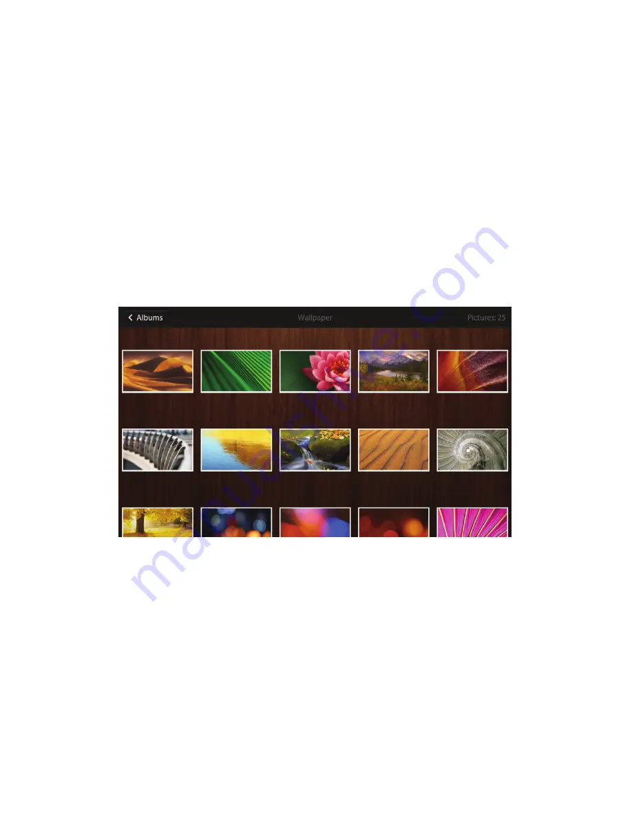
into your application instead of a container for the entire application. For example, if the number of photo albums does not
fit on the display area of the screen, show part of a photo album at the edge of the screen so that it is obvious to users that
they can view more albums by swiping up or down on the screen.
Use a canvas strategy
The large area of a typical computer interface allows you to present an application with a mix of content and UI
components. The same application that is created for the BlackBerry PlayBook tablet requires a different strategy. In most
situations, your application should make use of the entire screen, use gestures to control workflow, and access additional
options only when necessary.
If you have a large amount of information to present, try to think of the screen as a frame that contains a small view of a
large canvas. Users can move the view by dragging a finger in any direction, or by swiping to move the view quicker or a
greater distance. For example, you might use this type of interaction when navigating within a map or large image.
UI Guidelines
Design principles
8


