A
A-7
Desktop Color Primer
A few rules of thumb
Try some of the following strategies for creating successful color materials:
• Rather than applying colors indiscriminately, use color to aid comprehension. In
presentations, graphs, and charts, use color to highlight patterns and emphasize
differences.
• In general, fewer colors work better than many colors.
• Use red as an accent color. Red is particularly effective when used in otherwise
monochromatic materials.
• Consider the tastes of your target audience when choosing colors.
• Keep a file of printed color pieces that appeal to you or strike you as effective. Refer
to it for ideas when designing your own documents.
Color wheel
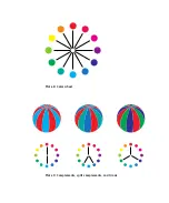
A color wheel (plate 8) is a helpful tool for understanding the interrelation of colors.
The colors on one side of the color wheel, from magenta to yellow, appear to most
people to be warm colors, while those on the other side, from green to blue, appear to
be cool. The distance between two colors on the color wheel can help predict how they
will appear when seen side by side.
Colors opposite one another on the wheel are called complements (plate 9), and create
a striking contrast side by side. This can be the basis for a bold graphical design, but it
is an effect you should use with discretion since it can be visually fatiguing. Other bold
combinations to consider are split complements (a color and the two colors adjacent to
its complement) and triads (three colors evenly spaced on the color wheel). Colors
adjacent to one another on the color wheel result in subtle harmonies.
The color wheel simplifies color relationships for the purpose of clarity, showing only
saturated or pure colors. Adding the myriad variations of each hue to the palette (more
or less saturated, darker or lighter) creates a wealth of possibilities. Taking a pair of
complements from the color wheel and varying the saturation and brightness of one or
both colors produces a very different result from the pure complements. Combining a
light tint of a warm color with a darker shade of its cooler complement often gives
pleasing results. Combining a darker shade of a warm color with a light tint of its
cooler complement produces an unusual effect you may like.
Summary of Contents for ColorPASS-Z5000
Page 1: ...ColorPASS Z5000 COLOR GUIDE I N C L U D E S F I E R Y S O F T W A R E ...
Page 2: ......
Page 6: ......
Page 96: ......
Page 148: ......
Page 160: ......
Page 172: ......
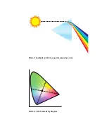
Page 175: ...Plate 1 Sunlight split into spectral colors by prism Plate 2 CIE chromaticity diagram ...
Page 179: ...Plate 5 Additive color model Plate 6 Color monitor ...
Page 180: ...Plate 7 Subtractive color model ...
Page 185: ...Plate 8 Color wheel Plate 9 Complements split complements and triads ...
Page 198: ......
Page 206: ......
Page 208: ......

