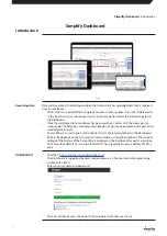
•
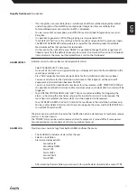
To switch to “Chart View”, click on a Control Unit and press “NEXT” or double-click the Control
Unit . “HUM” (relative humidity) is then displayed by default for all Sensor Boxes linked to the
Control Unit .
•
Data is displayed by default for the last 14 calendar days . If all data is required, press “Load All
Data” . Alternatively, you can specify another date range .
•
It is possible to scroll in “Chart View”, after which a box will be displayed per Sensor Box with
information about it such as ACTIVE/PASSIVE, Name, type, ID, DWT, HUM, PDV, TEMP, WCT,
PWR, BAT as well as the most recent values tread for all parameters .
•
By clicking the icon
in the boxes the name of the Sensor Boxes can be changed and
saved by pressing
•
The “On/Off” indication for the Relay Box or Integration Box .
•
Alarms are displayed for “full water tank” or “technical error” in CDT from the Integration Box .
•
“ACTIVE” means that the Sensor Box transmits data to a Control Unit .
•
“PASSIVE” means that the Sensor Box does not transmit data to a Control Unit .
•
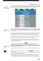
“SEE ALL DATA” displays all data for the respective Sensor Box .
•
By marking the desired parameters in the box for each Sensor Box, the corresponding graph
is displayed following each click . The most recently received data is displayed in the colour
field for the respective parameters .
As a rule, each field has a colour selected by the Dashboard . It can be edited and is used in
the graph .
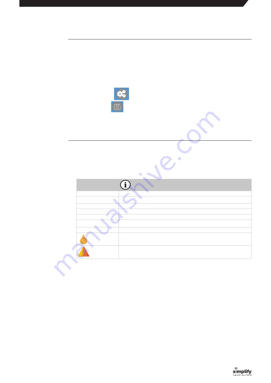
Abbreviation
HUM
Relative humidity
TEMP
Temperature
DWT
Dew point
PDV
Saturated vapour pressure
WCT
Water content
PWR
Power consumption/output
BAT
Battery voltage
Full water tank
Technical alarm
Note that the different parameters have different values .
Therefore, you must test your way forward to produce "readable" graphs .
•
If you would like to have fewer Sensor Boxes displayed in the graph, eliminate all unwanted
Sensor Boxes by removing the
√
in the individual boxes or using the select/deselect button,
which can also be used to mark all boxes at once .
•
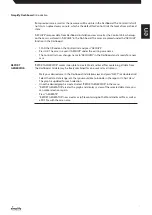
In CHART TYPE, it is possible to view additional mean trends by selecting:
HOURLY
DAILY
WEEKLY
or MONTHLY
all of which will even out the graph .
•
If you would like to study a particular time range (in the graph), place the cursor at the
beginning of the time range and then mark the desired range by pressing the mouse pad
and holding it down . To find the range, “drag” the area forward using the mouse pad . This will
update the graph . It is possible to zoom along both the x and y-axis . Alternatively, it is pos-
sible to input date ranges . To go back, press “SHOW ALL” .
CHART view
“SEE ALL DATA”
Simplify Dashboard
: Introduction
18

