Exinda Network Orchestrator
3 Using
|
227
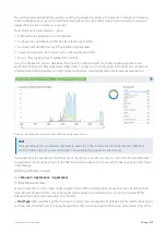
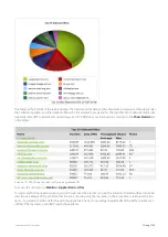
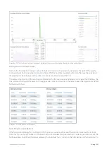
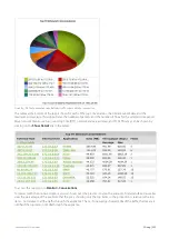
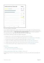
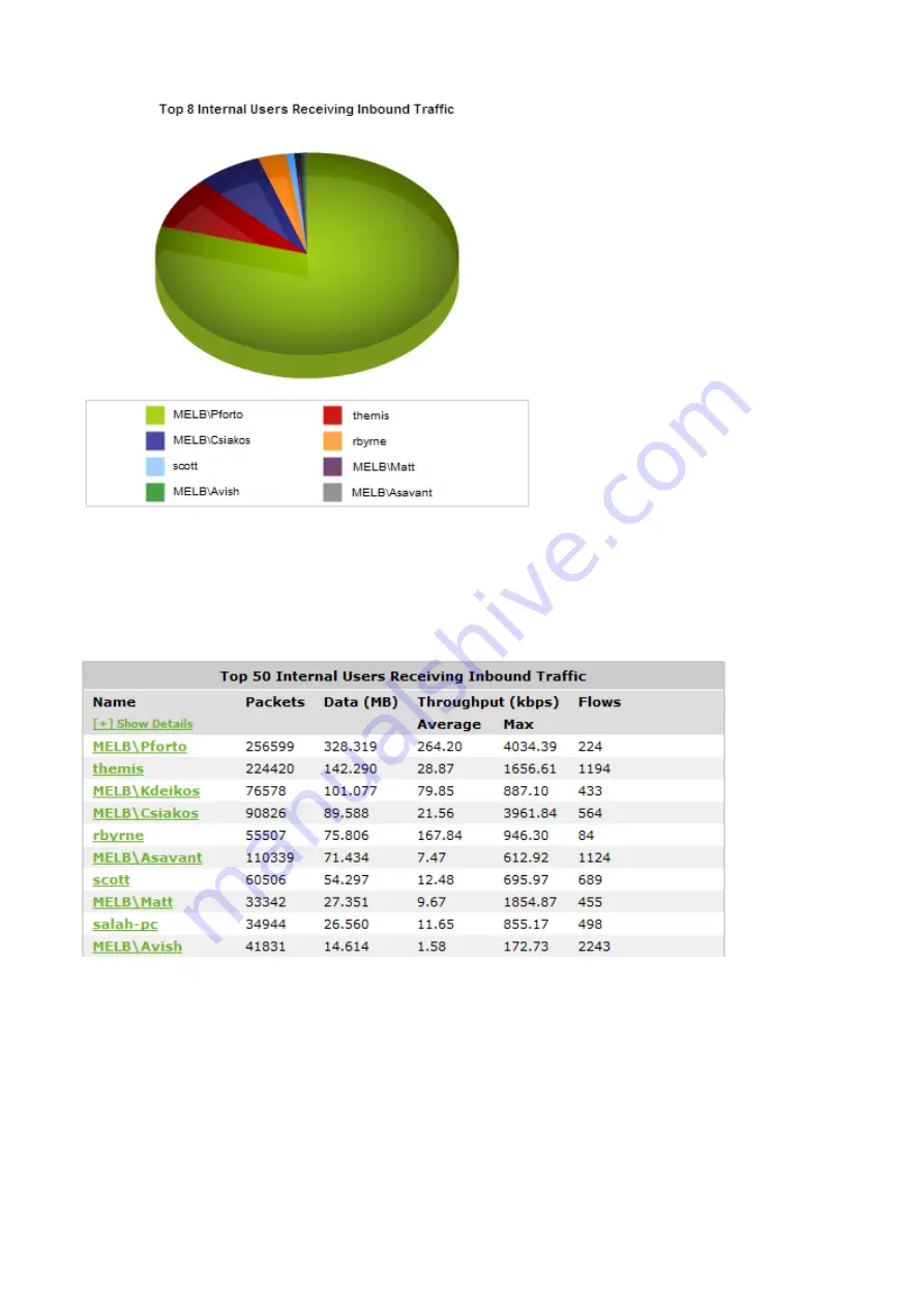
Screenshot 93: The Users report displays traffic volume by user.
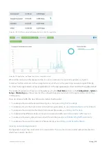
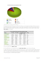
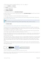
The tables at the bottom of the report shows for each of the top users, the total amount of data, and the maximum and
average throughput rates, the number of packets, and the number of flows for the selected time period. More network
metrics, such as, round-trip time (RTT), network and server delays, and TCP efficiency can be shown by clicking on the
Show Details
link in the tables.
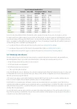
Screenshot 94: The table on the Users report shows traffic volume metrics broken down by user.
To access this report, go to
Monitor > Users
.
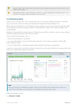
To show only internal users or external users, use the
Select Users to View
selector at the top of the page.
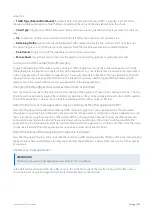
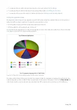
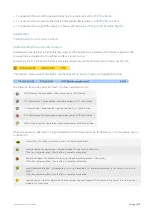
To interact with the pie-based reports, you can hover over the pie slices to view the amount of data transferred as well as
view the percentage of the pie. Note that the pie is showing only the top items, so the proportion is relative to the top
items - not relative to all the traffic through the appliance. That is, if one wedge showed 50% of the traffic, that means it
is 50% of the top items, not 50% through the appliance.
Summary of Contents for EXNV-10063
Page 369: ...Exinda Network Orchestrator 4 Settings 369 ...
Page 411: ...Exinda Network Orchestrator 4 Settings 411 Screenshot 168 P2P OverflowVirtualCircuit ...
Page 420: ...Exinda Network Orchestrator 4 Settings 420 Screenshot 175 Students OverflowVirtualCircuit ...


