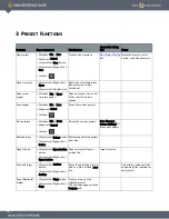
2 T
YPES
OF
C
ONTROLS
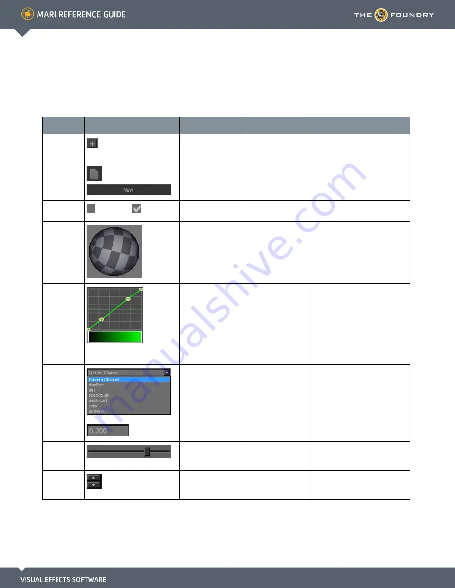
Control
What it looks like
What it does
How to use it
Notes
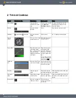
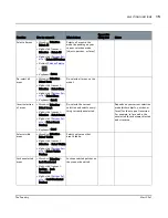
Add attribute
Lets you add an
attribute to a prop-
erty.
Click the icon, and fill
in the
Add User
Attribute
dialog box.
For more information, see the
Extending Mari chapter in the
Mari User Guide.
Buttons
,
Lets you select a
function.
Click it.
May show an icon or a word.
Checkbox
unselected,
selected
Lets you select an
option.
Click to select.
An “x” displays when selected.
Control
sphere
Lets you move a light
around the scene.
Click and drag to pull
the light around.
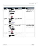
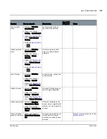
Curve editor
Maps between input
and output values
(45° = the same). Bar
along the bottom
displays the effect at
each point.
Drag to move points
on the graph. Add
points by clicking on
the curve or bar. Edit
a point by right-click-
ing it.
You can also remove a
point by clicking on it
while holding Ctrl.
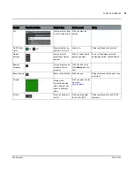
Dropdown
list
Lets you select from
a list of valid values.
Click the down arrow
on the right, then click
to select an option.
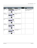
Entry box
Lets you type an
entry.
Click inside the box
and type a valid entry.
Often combined with a slider and
reset button.
Horizontal
slider
Slides along a range
of valid values.
Click and drag left
(more) or right (less).
Often combined with an entry box
(that shows the value) and reset
button.
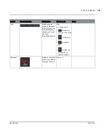
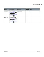
Incrementers
Lets you increment a
value up or down.
Click up or down
arrows to increment
up or down.


