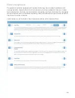
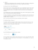
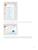


You can assign a report to be part of your dashboard when you first sign in by selecting it
from the list and then selecting
Enable Dashboard
. To customize a report, select it from
the list and then select
Edit in Excel
to make changes.
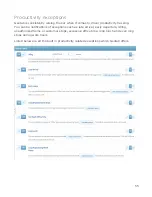
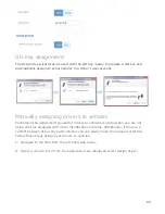
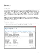
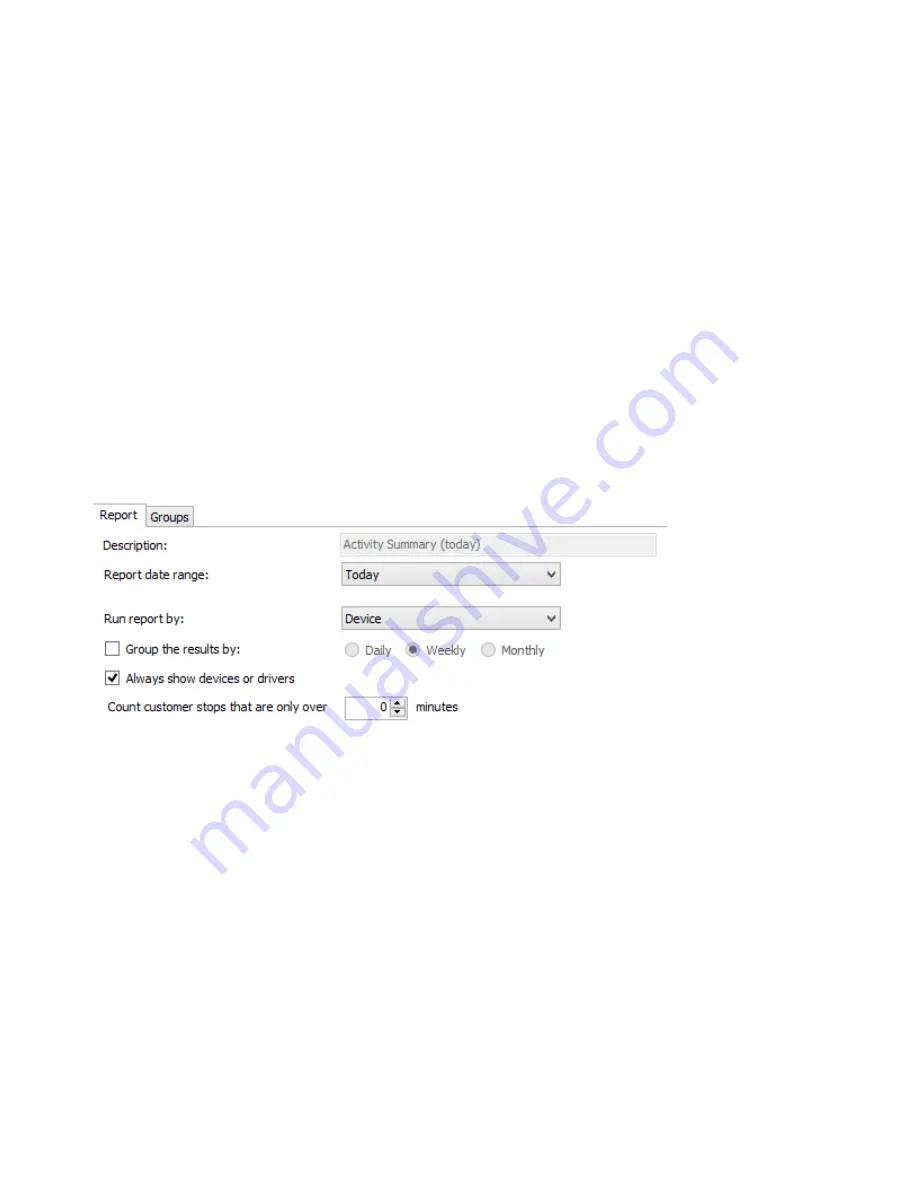
Customizing reports
Using Excel to create custom reports allows for limitless options for analyzing your fleet
and driver behavior. Using Microsoft Excel, you can include fleet metrics, charts, formulas
and even match your organizations color scheme for customer facing reports. The
following options are available for customizing reports:
●
Make changes to templates using Microsoft Excel
●
Configure user level access to individual reports
●
Set custom reports as a dashboard
●
Control how often a dashboard is automatically refreshed
●
Schedule reports to be emailed to users
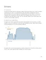
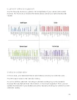
Dashboards
Geotab has many different options for what you will initially see when signing in. One
of those options is the dashboard; a graphical view of your reports all on one page. The
dashboard is meant to highlight critical events and behaviors throughout your entire
fleet at a single glance. The reports displayed are up to you and can be customized using
Microsoft Excel.
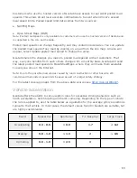
List below are the built in dashboards which help establish insights to your fleet.
●
Driver Score (Rates your drivers based on speeding, after hours driving and excessive
idling)
●
Idle Time (Compares time spent idling as a percentage of the total driving time)
69