©2016 IQtronic technologies Europe, s.r.o.
Page 9 of 22
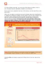
To proper display the graph, you must have Flash player installed, which is
not, for safety reasons, standardly enabled in your browser.
If we want to have a detailed overview of the history, use the data filter on the
bottom left.
Where you can adjust everything you need to display data, their classification,
or obtaining of statistical variables. VIn the graph, there are also minimum and
maximum values marked by a black triangle. Visualization of data larger
interval, such as the season has resulted in a smaller display selection of
values without averaging.
The most accurate representation offers daily
interval, in which is shown in the graph, each value that is obtained by
reading the values of the sensor every 3 minutes.
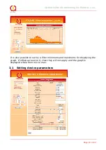
Checkbox
FILL
will display a graph with fillings from its current value to the
axis X.
Note:
Correct NTP settings is required for normal functionality of datalogger.
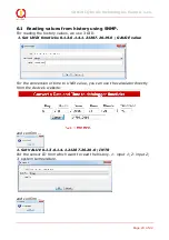
All datalogger datas is possible to read from history by SNMP also.


