Reports and Listings
4-8
Issue 1 January 1997
Chart
Purpose
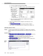
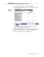
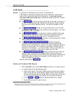
To choose a graphic representation for a summary report:
The bar chart displays report parameters — for example, hours in a Time of Day
Report — as bars against a vertical (or horizontal) scale.
2-D Bar
(with grids
on the
X-axis and
on Y-axis)
A bar’s height (or length)
corresponds to a value
on the scale — typically
the number of calls.
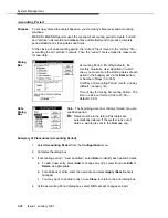
A pie chart displays report parameters — for example, hours in a Time of Day Report
— as individual “slices” in a pie.
3-D Pie
Chart
The size of a slice
represents the percent of
the number of calls
matching that parameter.
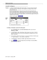
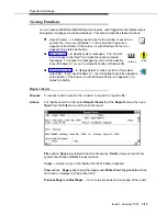
Summary of Procedures
1.
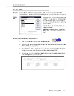
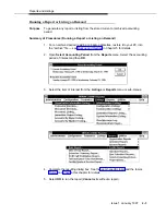
Select the Chart button on any report or listing dialog box.
2.
Complete the dialog box then use OK to save settings and return to the
originating report or listing dialog box (Cancel returns without changing the
default output).

