Tutorial: Building custom components with Flex Builder
47
Build the shopping cart component
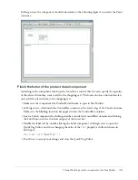
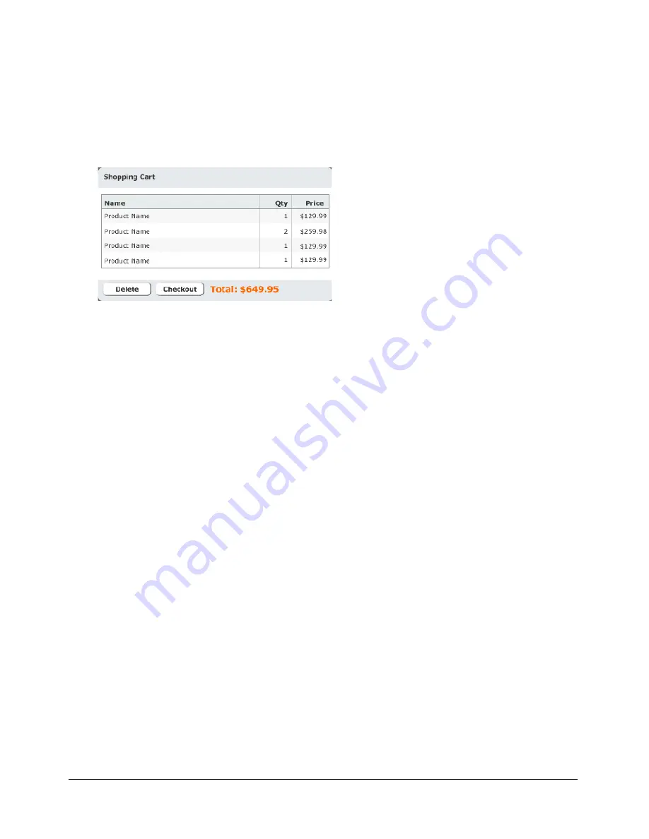
According to the component’s functional specification, the shopping cart component should
display the products that the user wants to bring to the checkout area for purchase. The user can
delete items from the cart by selecting an item and clicking the Delete button. The user can also
proceed to the checkout area by clicking the Checkout button.
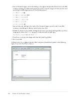
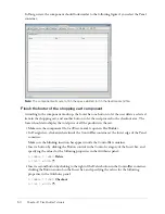
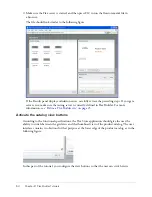
The following is a mock-up of the component:
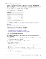
The shopping cart component does not contain any data in this tutorial. Another tutorial
describes how to add data (see
“Tutorial: Binding components to data with Flex Builder”
on page 58
).
The Checkout button is disabled in these tutorials.
In this part of the tutorial, you complete the following tasks:
•
“Lay out the shopping cart component” on page 47
•
“Add the product list to the shopping cart” on page 48
•
“Finish the footer of the shopping cart component” on page 50
Lay out the shopping cart component
After studying the component mock-up, you decide to use the following Flex containers to lay
out the component:
•
A Panel container to create the header and position the component’s child containers vertically
•
A ControlBar container to create the footer
You start by creating a component file based on a Panel container.
1.
In Flex Builder, press N.
The New Document dialog box appears.
2.
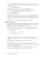
Select Flex Development in the left pane and double-click MXML Component:Panel in the
right pane.
The dialog box closes and a component file with a Panel container appears.
3.
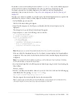
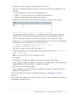
Double-click the Panel container and enter the following property value (shown in bold type)
in the Quick Tag Editor:
<mx:Panel... title=
"Shopping Cart"
/>
Summary of Contents for FLEX BUILDER-USING FLEX BUILDER
Page 1: ...Using Flex Builder...
Page 116: ...116 Chapter 4 Building a Flex User Interface Visually...
Page 144: ...144 Chapter 6 Working with Data...
Page 154: ...154 Appendix A Basic Flex Concepts...

