Tutorial: Building custom components with Flex Builder
49
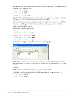
3.
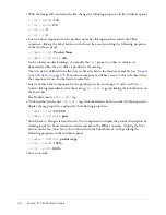
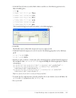
Click the Plus (+) button to add a third column, and then set the following options in the
DataGrid dialog box:
■
ID
:
dg
■
Header Text (first row)
:
Name
■
Header Text (second row)
:
Qty
■
Header Text (third row)
:
Price
■
Column Name (first row)
:
name
■
Column Name (second row)
:
qty
■
Column Name (third row)
:
price
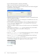
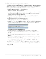
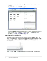
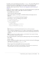
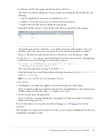
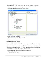
The DataGrid dialog box should look similar to the following figure:
4.
Click OK.
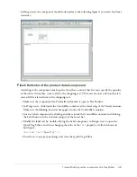
Flex Builder inserts a DataGrid component in your component file.
5.
Click the DataGrid component to select it and set the following properties in the Attributes
panel:
■
Size > height
:
100%
■
Size > width
:
100%
6.
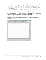
Switch to Code view (View > Code) and set the column properties of the DataGrid component
by locating the three
<mx:DataGridColumn>
tags and adding the following properties (shown
in bold type):
<mx:DataGridColumn headerText="Name" columnName="name"
width="180"
/>
<mx:DataGridColumn headerText="Qty" columnName="qty"
width="50"
textAlign="right" marginRight="4"
/>
<mx:DataGridColumn headerText="Price" columnName="price"
width="60"
textAlign="right" marginRight="4"
/>
Tip:
You can use Code hints to quickly set these properties.
7.
To make sure the component fits correctly in the Flex Store user interface, locate and delete the
height
and
width
properties in the
<mx:Panel>
tag.
8.
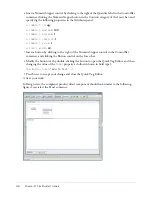
Save your work.
Summary of Contents for FLEX BUILDER-USING FLEX BUILDER
Page 1: ...Using Flex Builder...
Page 116: ...116 Chapter 4 Building a Flex User Interface Visually...
Page 144: ...144 Chapter 6 Working with Data...
Page 154: ...154 Appendix A Basic Flex Concepts...

