34
Analyzing Tag Data (continued)
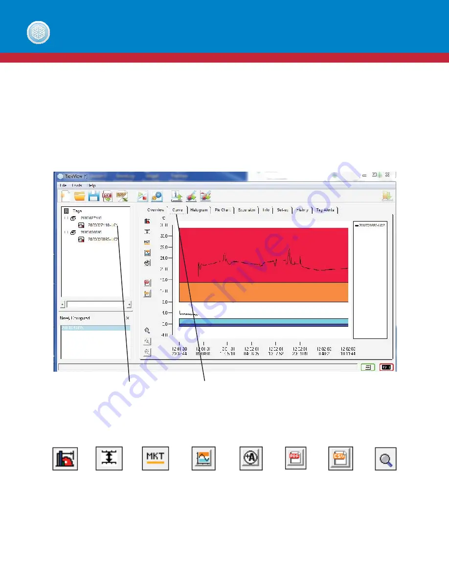
CURVE TAB
The curve tab gives a detailed view of the temperature history recorded by a tag. Shades of red are representative of high
excursion temperatures, shades of blue are representative of low excursion temperatures and white is representative of
acceptable temperature. These colors allow easy, at-a-glance interpretation of when excursions have occurred. The curve
line represents logged data points.
On the Curve graph tab, you can utilize the following tools to analyze your data:
TREKVIEW SOFTWARE
Rollover
Curve
Icon
Relative
Time
Icon
Mean Kinetic
Temperature
Icon
Curve
Options
Icon
Annotations
Icon
CSV
Icon
Icon
Curve
Zoom
Icon
Select the tag data
Curve tab
Summary of Contents for Trekview
Page 1: ...1 TREKVIEW MANUAL ...


