Using Lists & Spreadsheet
563
•
The X (or Y) List contains numeric or string values (such as 1999 or
“color”). Numeric values result in a histogram. String values identify
the categories for a bar chart.
•
The Summary List contains numeric values (such as count, frequency,
or probability) for each element in the other list.
To create a summary plot:
Note:
For situations in which you already have a summary table, you can
skip the first two steps.
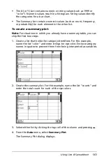
1. Create a list that holds the category identifiers. For this example,
name the list “color” and enter strings for eye color. Enclose category
names in quotes to prevent them from being interpreted as variables.
2. Create the summary list. For this example, name the list “counts” and
enter the total count for each of the eye colors.
3. Select either list by clicking the top cell of the column and pressing
£
.
4. From the
Data
menu, select
Summary Plot
.
The Summary Plot dialog displays.
Summary of Contents for TI-Nspire
Page 38: ...26 Setting up the TI Nspire Navigator Teacher Software ...
Page 46: ...34 Getting started with the TI Nspire Navigator Teacher Software ...
Page 84: ...72 Using the Content Workspace ...
Page 180: ...168 Capturing Screens ...
Page 256: ...244 Embedding documents in web pages ...
Page 336: ...324 Polling students ...
Page 374: ...362 Using the Review Workspace ...
Page 436: ...424 Calculator ...
Page 450: ...438 Using Variables ...
Page 602: ...590 Using Lists Spreadsheet ...
Page 676: ...664 Using Notes You can also change the sample size and restart the sampling ...
Page 684: ...672 Libraries ...
Page 714: ...702 Programming ...
Page 828: ...816 Data Collection and Analysis ...
Page 846: ...834 Regulatory Information ...
Page 848: ...836 ...

