34
Chapter 10: Tools
airFiber
®
X User Guide
Ubiquiti Networks, Inc.
Charts
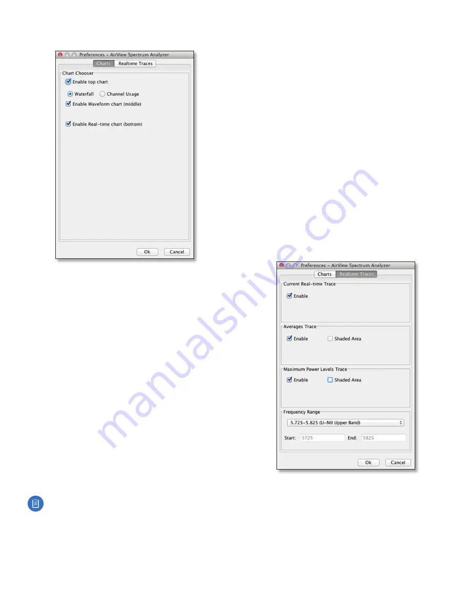
Enable top chart
Check the box to enable the top chart.
Select the desired chart to display in the top chart panel
on the main view. There are two options:
•
Waterfall
This time‑based graph shows the aggregate
energy collected for each frequency since the start
of the airView session. The energy color designates
its amplitude. Cooler colors represent lower energy
levels (with blue representing the lowest levels)
in that frequency bin, and warmer colors (yellow,
orange, or red) represent higher energy levels in that
frequency bin.
The Waterfall View’s legend (top‑right corner) provides
a numerical guide associating the various colors to
power levels (in dBm). The low end of that legend (left)
is always adjusted to the calculated noise floor, and the
high end (right) is set to the highest detected power
level since the start of the airView session.
•
Channel Usage
For each channel, a bar displays a
percentage showing the relative “crowdedness” of
that specific channel. To calculate this percentage, the
airView Spectrum Analyzer analyzes both the popularity
and strength of RF energy in that channel since the start
of an airView session.
Note:
airFiber X radio channels are not related
to Wi‑Fi channels which are determined by IEEE
standards. airFiber X radio channels are numbered
consecutively starting with 0 and are 28 MHz in
width.
Enable Waveform chart (middle)
Check the box to
enable the middle chart. This time‑based graph shows
the RF signature of the noise environment since the
start of the airView session. The energy color designates
its amplitude. Cooler colors represent lower energy
levels (with blue representing the lowest levels) in that
frequency bin, and warmer colors (yellow, orange, or red)
represent higher energy levels in that frequency bin.
The spectral view over time will display the steady‑state RF
energy signature of a given environment.
Enable Real-time chart (bottom)
Check the box to
enable the bottom chart. This graph displays a traditional
spectrum analyzer in which energy (in dBm) is shown in
real time as a function of frequency. There are three traces
in this view:
•
Current
(Yellow) Shows the real‑time energy seen by
the device as a function of frequency.
•
Average
(Green) Shows the running average energy
across frequency.
•
Maximum
(Blue) Shows updates and maximum power
levels across frequency.
Real-Time Traces
The following settings apply only to the
Real-time
chart:
Current Real-time Trace
Check the
Enable
box to enable
the real‑time trace. When enabled, the yellow outline on
the
Real-time
chart represents the real‑time power level of
each frequency. The refresh speed depends on the FPS.


