26
© Vbrick Systems, Inc.
interface card). Selecting the Hardware View will automatically stack the results and hide
the Total (which is the sum of all the NICs).
•
Graph in UNIT_MEASURE
. This allows you to select the unit measure for the graph.
It is always displayed in bps (bits per second), but you can display it in Mbps, Gbps, etc.
Changing the units will also change the chart title at the bottom of the chart to help
avoid confusion.
•
Colors
. A selection of different colors for the chart.
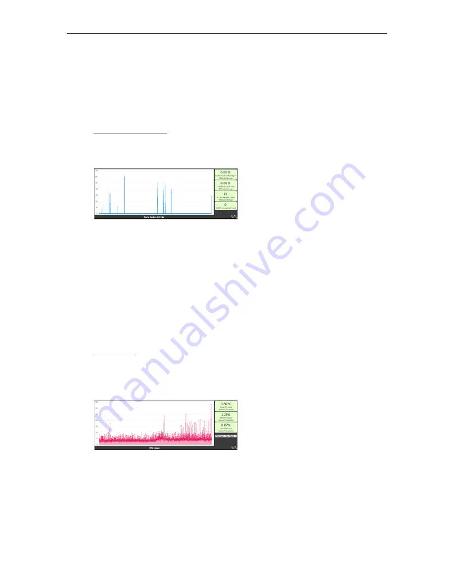
Local Cache Activity.
This multi dataset graph provides insight into how much your local
DME cache is being used (either from local or remote requests). These numbers are 5 minute
averages and samples. Snapshots of additional current measures are provided on the right
hand side.
Toggle the axis and legend to see the datasets included in this chart, they are:
•
Dataset: Cache Hits % of Total Bytes
. This is the percentage of bytes delivered that
come from the cache. Logically, the higher the better for this measure as performance
from the cache is quicker and more efficient. In some cases you may see negative results
– this represents requests made but not fully delivered by the cache (this is expected in
some use cases).
•
Dataset: HTTP/S Request Count
. This is a raw count from our cachine engine on the
number of requests to the DME.
•
Dataset: HTTP/S % Cache Hits
. This is the percentage of request counts that are
delivered by the cache. This differs from the measure above because this is a count of
requests, not total bytes delivered by the requests. Again, the higher the better – this
translates directly as how your cache is being used.
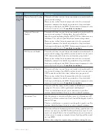
CPU Usage.
This is a running representation of your (aggregated) CPU usage. In most
cases, your CPU usage will bounce within a range (these are snapshots, not averages), but the
trend should be evident. This view can also illustrate the impact of high CPU DME actives
(e.g., transrating via Stream Conversion feature). Snapshots of additional current measures
are provided on the right hand side.
There is one additional control related to this graph:
•
Windowed Average.
The dropdown within the CPU chart will allow for viewing the raw
data (select "No Span, Raw Data") or a windowed average ("Average Span N=??"). A
windowed average is calculated as the average of all the numbers (based on N) around a
data point. For example, using N=5 window or span, calculating the 12 element in the
dataset would be:
Data[12] = (Data[10] + Data[11] + Data[12] + Data[13] + Data[14])/5
Summary of Contents for dme
Page 1: ...Vbrick Distributed Media Engine vbrick dme v3 21 0 Admin Guide March 2019 ...
Page 12: ...xii Preface ...
Page 20: ...8 Vbrick Systems Inc ...
Page 22: ...10 Vbrick Systems Inc ...
Page 54: ...42 Vbrick Systems Inc ...
Page 156: ...144 Vbrick Systems Inc ...
Page 160: ...148 Vbrick Systems Inc ...
Page 176: ...164 Vbrick Systems Inc ...
Page 180: ...168 Vbrick Systems Inc ...
Page 194: ...182 Vbrick Systems Inc ...
Page 202: ...190 Vbrick Systems Inc http dme_ip_address HDS masterplaylistname manifest f4m ...
Page 208: ...196 Vbrick Systems Inc ...


