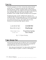
____________________________________ Advanced Imaging 7-17
PostScript
PostScript
Serif (Times Roman)
Sans Serif (Helvetica)
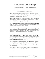
Fig. 7.7 Serif and Sans Serif Typefaces
Serif typefaces include extra flourishes such as the small circle at
the top of the a or the small tails hanging down each end of the cross
bar in the T in Times Roman (fig. 7.7).
Sans Serif typefaces lack the decorations. Sans means without, and
these kinds of typefaces have very clean, plain lines such as those
found in the Helvetica typeface (fig. 7.7).
Miscellaneous typefaces include those which have combinations of
serif and sans serif designs as well as graphic type characters such as
arrows, hearts, squares, or Greek symbols.
Each typeface category lends itself to particular areas of page design.
For example, the small detailed lines on a serif typeface helps draw a
reader’s eye across a line of text. This makes it well suited for body
text such as the Times Roman font used in this manual.
The clean, sharp lines of a sans serif typeface make it excellent for
short headlines or signs. The lack of detail, makes it easier for the
eye to group several words into a short phrase, grasping the meaning
at a glance. However, it lacks the drawing effect of details which
make long text blocks easier to read.
Miscellaneous typefaces are handy to draw attention to a particular
section of the page or indicate breaks in topics or sections. For
example, three diamonds (
◊
◊
◊
) signal the ends of major chapters
in this manual.
Your Accel-a-Writer 812’s PostScript typefaces feature all three
categories: serif, sans serif, and miscellaneous.


