RadioButton component
221
Customizing the RadioButton component
You can transform a RadioButton component horizontally and vertically both while authoring
and at runtime.
The bounding box of a RadioButton component is invisible and also designates the hit area
for the component. If you increase the size of the component, you also increase the size of the
hit area.
If the component’s bounding box is too small to fit the component label, the label clips to fit.
Using styles with the RadioButton component
You can set style properties to change the appearance of a RadioButton. If the name of a style
property ends in “Color”, it is a color style property and behaves differently than non-color
style properties.
A RadioButton component uses the following Halo styles:l
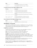
Property summary for the RadioButton class
Style Description
themeColor
The background of a component. This is the only color style that
doesn’t inherit its value. Possible values are "haloGreen", "haloBlue",
and "haloOrange".
color
The text of a component label.
disabledColor
The disabled color for text.
fontFamily
The font name for text.
fontSize
The point size for the font.
fontStyle
The font style; either "normal", or "italic".
fontWeight
The font weight; either "normal", or "bold".
Property Description
RadioButton.data
The value associated with a radio button instance.
RadioButton.groupName
The group name for a radio button group or radio button instance.
RadioButton.label
The text that appears next to a radio button.
RadioButton.labelPlacement
The orientation of the label text in relation to a radio button.
RadioButton.selected
Sets the state of the radio button instance to selected and deselects
the previously selected radio button.
RadioButton.selectedData
Selects the radio button in a radio button group with the specified
data value.
RadioButton.selection
A reference to the currently selected radio button in a radio
button group.
Summary of Contents for DIRECTOR MX 2004-USING DIRECTOR
Page 1: ...DIRECTOR MX 2004 Using Director...
Page 16: ...16 Chapter 1 Introduction...
Page 82: ...82 Chapter 3 Sprites...
Page 98: ...98 Chapter 4 Animation...
Page 134: ...134 Chapter 5 Bitmaps...
Page 242: ...242 Chapter 10 Sound and Synchronization...
Page 274: ...274 Chapter 11 Using Digital Video...
Page 290: ...290 Chapter 12 Behaviors...
Page 302: ...302 Chapter 13 Navigation and User Interaction...
Page 334: ...334 Chapter 15 The 3D Cast Member 3D Text and 3D Behaviors...
Page 392: ...392 Chapter 16 Working with Models and Model Resources...
Page 418: ...418 Chapter 18 Movies in a Window...
Page 446: ...446 Chapter 22 Managing and Testing Director Projects...


